Problem:
The existing Google Pay interface had usability issues: perhaps cluttered screens, confusing navigation or visual inconsistency (implied by the decision to redesign).
Users may have struggled with finding features, understanding flows, or felt the interface lacked visual clarity or modern aesthetic.
There was an opportunity to improve both the experience (UX) and the look & feel (UI) to better match user expectations and current design standards.
Solutions Provided:
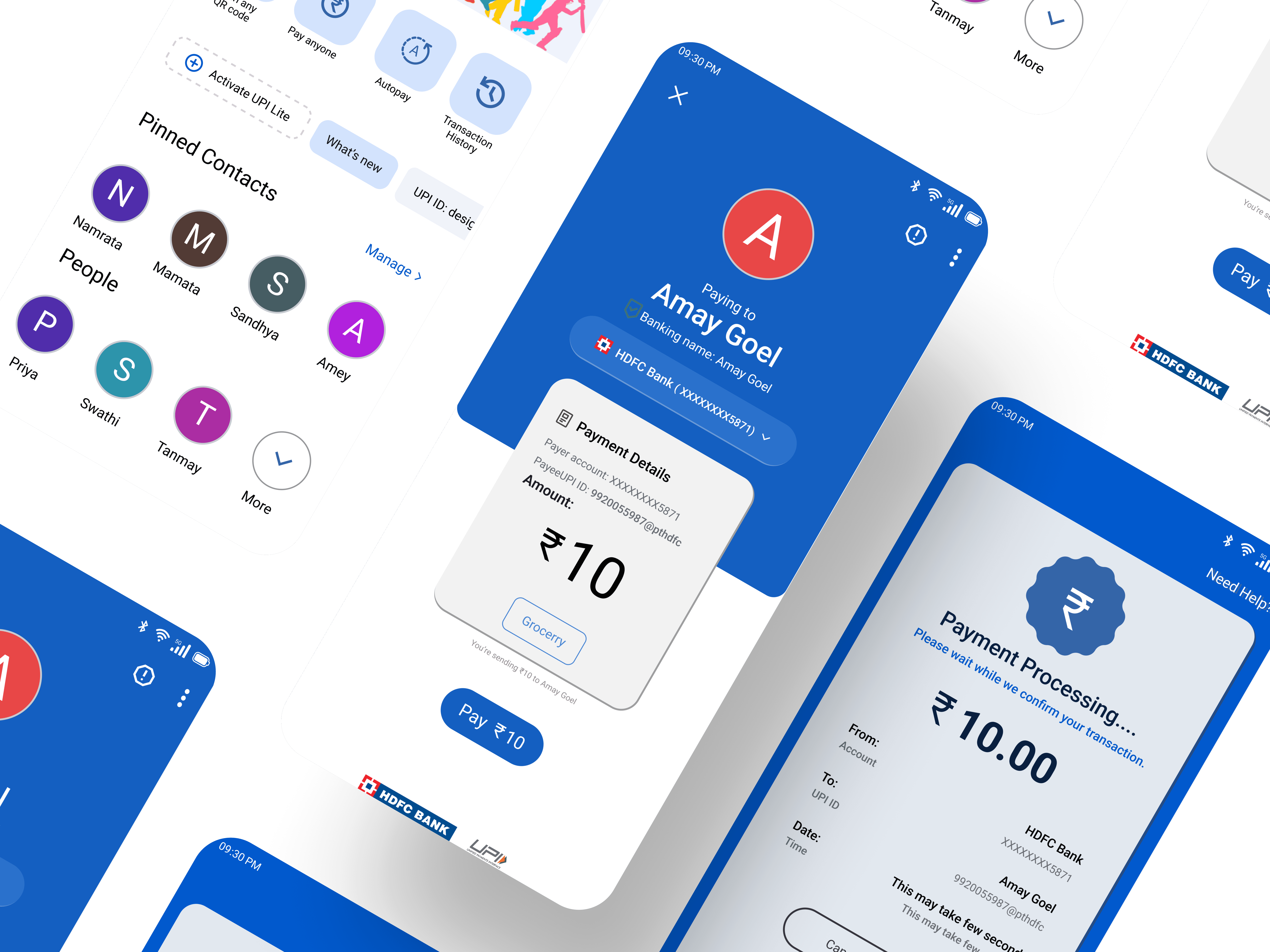
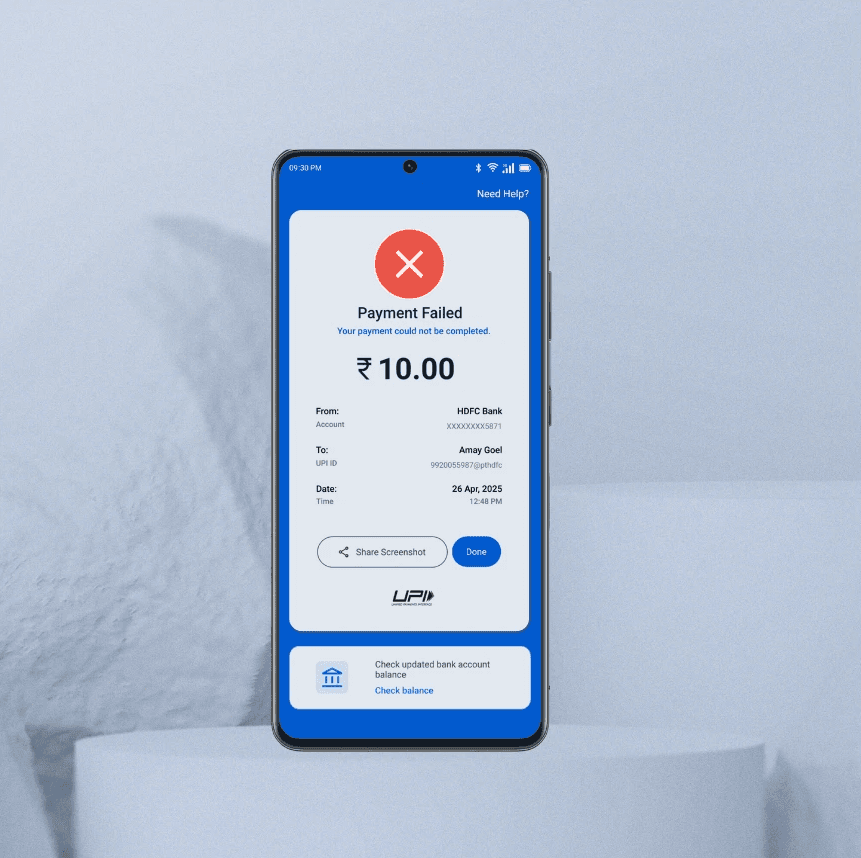
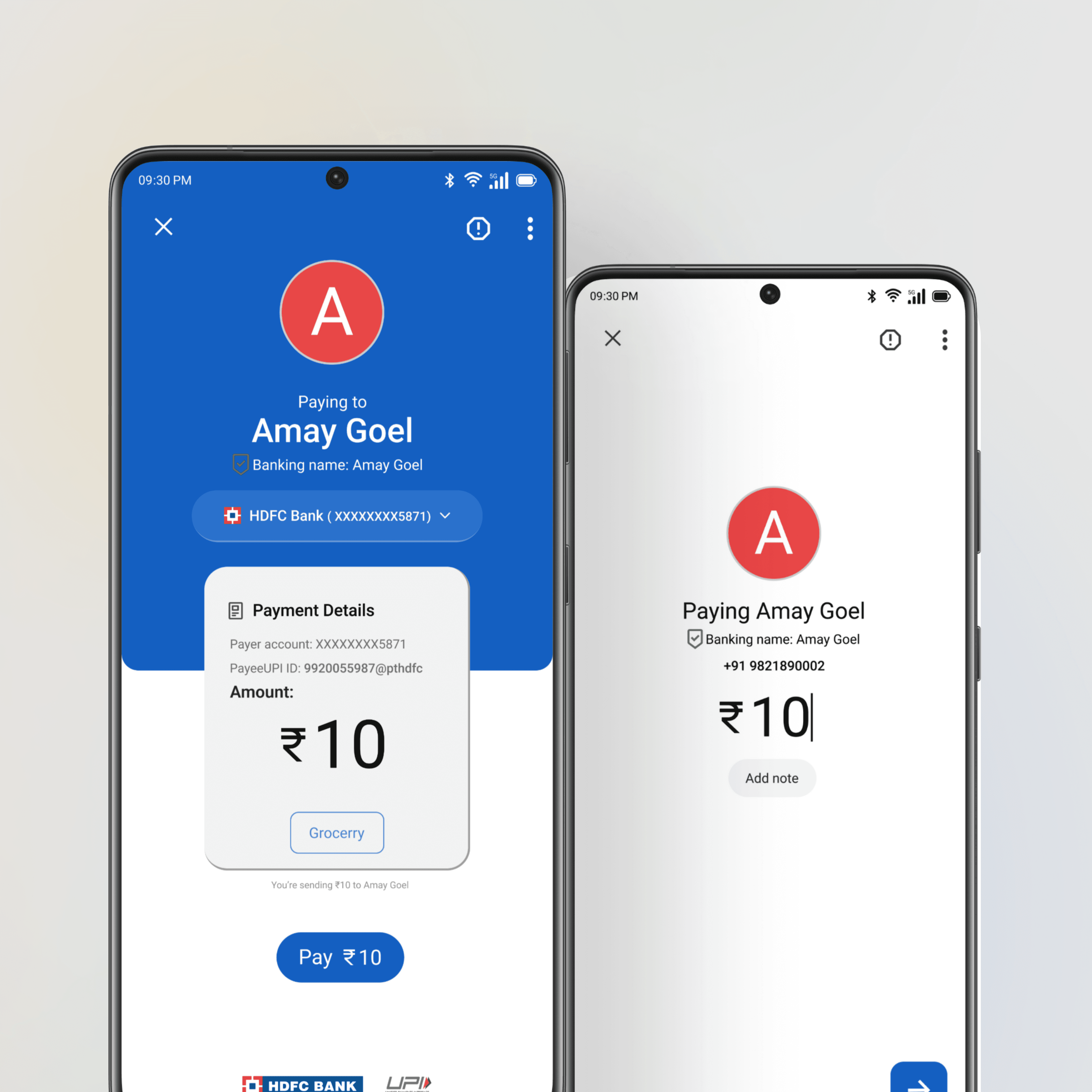
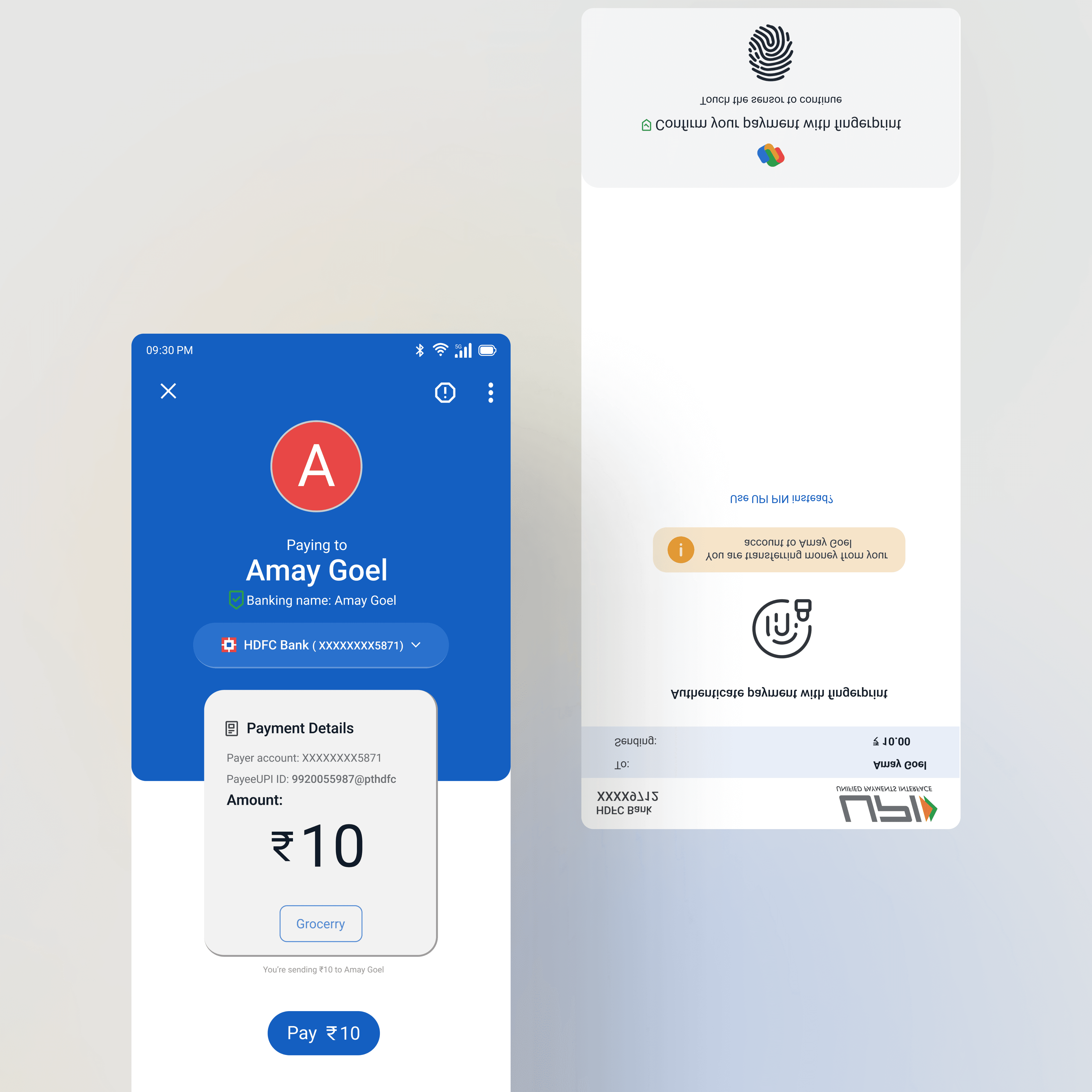
I re-designed the app screens with a focus on clear navigation, simplified layouts, and consistent visual language.
Created new wireframes and prototypes to test flows and interactions before finalizing UI.
Applied updated aesthetic choices: typography, color palette, iconography, spacing and micro-interactions to enhance usability and delight.
Ensured that the redesign supports quick access to major functions, reduces cognitive load, and visually aligns with contemporary mobile design trends.